AESOP DUKE OF YORK SQUARE
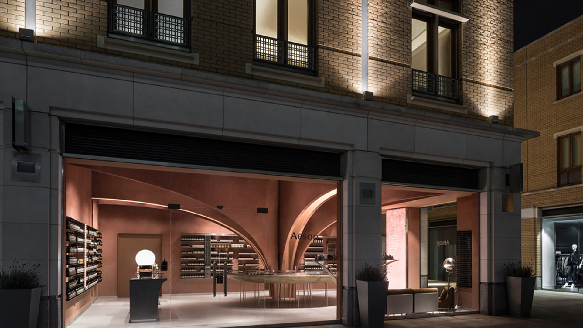
With an intriguing fusion of futuristic and classic design, Snøhetta has completed its first permanently built project in England. The 108-square-meter retail space, dubbed Aesop Duke of York Square, is the latest addition to Aesop’s series of uniquely designed boutiques around the world.
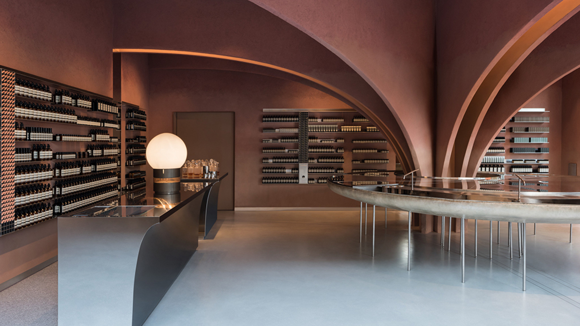
Situated in Chelsea, London, the store’s design is inspired by the contextual relevance of the location combined with an influence of futuristic elements. The result is an interior characterized by classic architypes, a pale red colour palette, and stainless-steel elements.
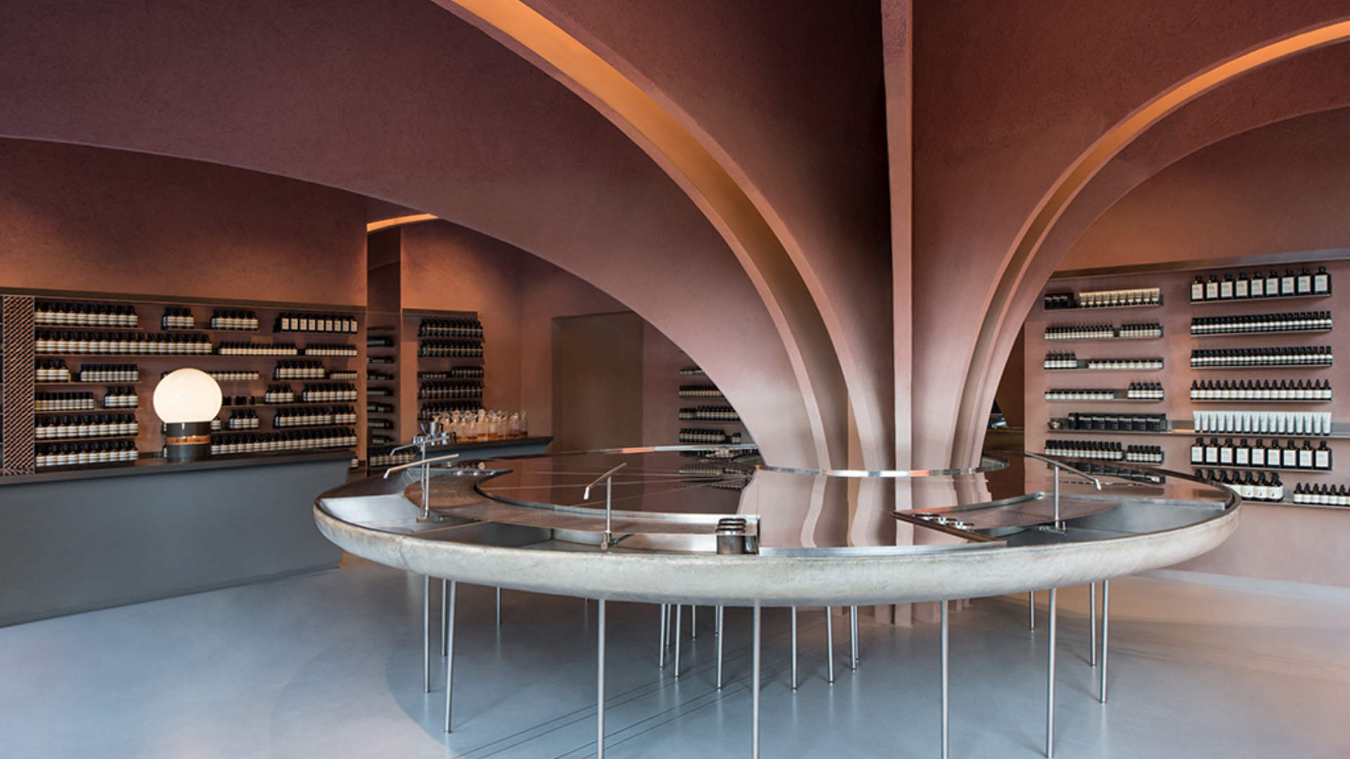
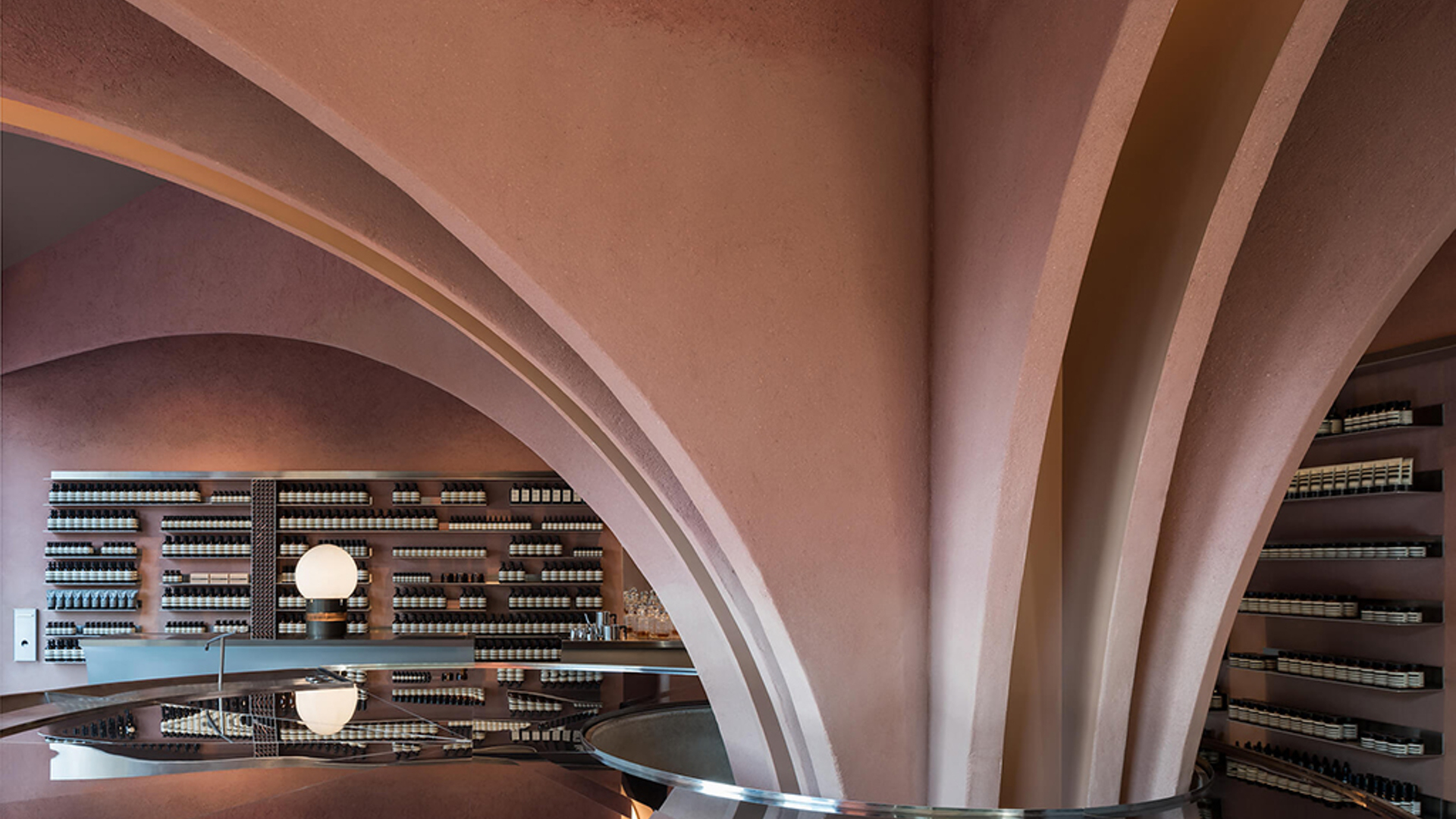
An existing column is used as the starting point for the store’s layout. From this centralized column, 12 arches stretch towards the perimeter walls. This series of arches function as a key element in creating a sense of organizational hierarchy, establishing visual separators within the space. The arches are clad in a clay based plaster with a subtle gradient colour, ranging from a lighter base to a darker shade. Illumination from between the arches further emphasizes the gradient effect.
Expanding out from the centralized column, a sink in a circular shape establishes itself as the natural meeting point of the store. The sink, which is an integral part of all Aesop’s stores, appears as a hovering water mirror reflecting the light and colours of the ceiling. Made from polished stainless steel and glass fiber, the sink becomes a focal element, while simultaneously allowing for an optimized flow of people within the space.
The walls, ceiling, and arches are clad in a pink-pigmented clay based plaster, giving the space a royal rose-colour. The clay plaster is delivered by Clayworks and sourced from South West counties of England. This simple and clear colour palette is contrasted by extensive use of steel in the other custom elements of the store.
The contrasts created by the rough surfaces of the walls against the soft, polished expression of the clear stainless-steel shapes, the play with colour gradients, as well as the changes in light throughout the space, all underline a sense of depth to the design. Combined with the traditional arches and futuristic elements such as the sink, the design aims to trigger customer’s sense of curiosity.
Photo credits: Snøhetta


