PECK CITYLIFE
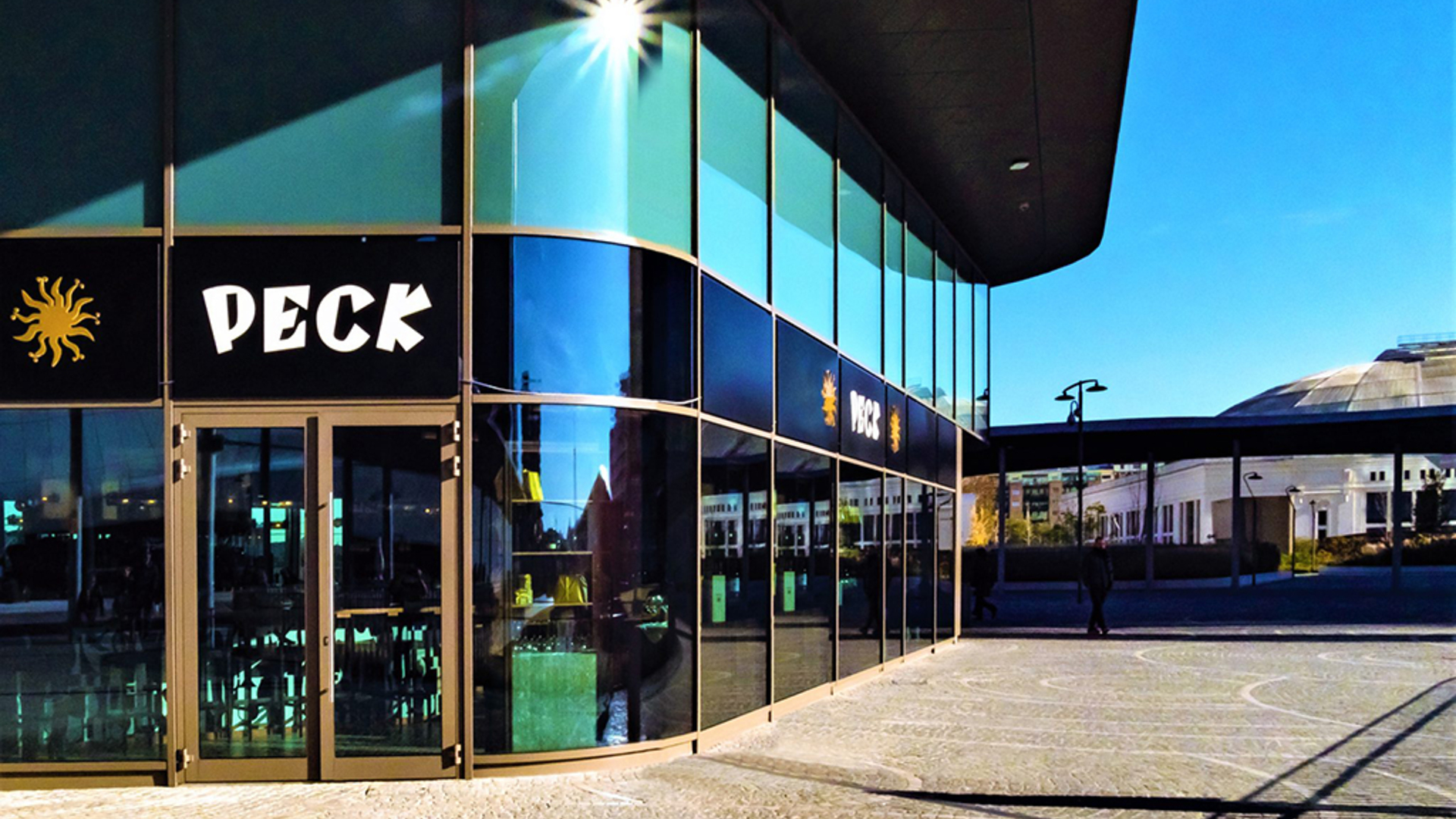
Peck CityLife is located in a 300m² organically-shaped pavilion in Piazza Tre Torri, central in relation to the entrance to the Shopping District and the architecture which is symbolic of the new city.
Claudio Saverino and Tiziano Vudafieri have defined a concept capable of expressing the fundamental features of Peck’s historic identity, bringing it into a design which is at once timeless and highly contemporary. It is, first and foremost, a project of “designing relationships”, namely those between different people and times.
The interior design was structured so as to provide a narrative continuity throughout the different areas to create a fluid relationship between the delicatessen, restaurant, wine bar and cocktail bar. Four places which differ in their function and relationship with the public, but which all make for a unique experience.
The space pays tribute to post-war Milan, the reconstruction, the economic miracle, the hard work and vision of the Milanese - the Milan in which the legend of Peck established itself - without making the place didactic.
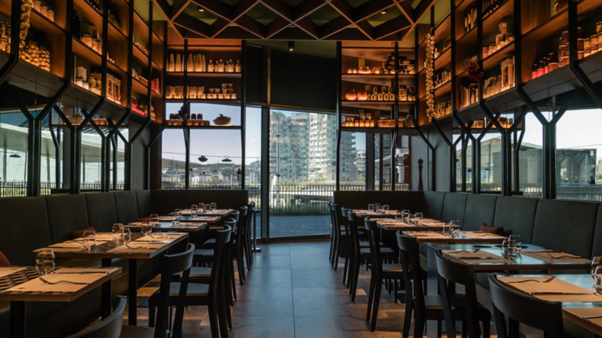
The quotations pay homage to a shared history: the flooring is redolent of historic Milanese stone, the ceppo di Gré from the quarries of Lake Iseo. The restaurant’s false ceiling, with wooden panelling, recalls Villa Necchi Campiglio in Portaluppi, as well as the struts which hold up the shelves are evocative of the BBPR’s Velasca Tower. For the seating, meanwhile, Gio Ponti was chosen: elegance and essentiality.
Subliminal, rather than explicit, messages of a sober yet bold Milanese character.
The decorative lamps, with their modern, post-industrial look, are intended to recall the aesthetic tradition of Milanese palaces, with attention to the choice of light fixtures whose presence is peculiar.
The aim was to create an environment rich with symbolic elements to reconcile Peck’s historical identity with its more modern and contemporary dimension. A bridge between the tradition of fine dining and the new city.
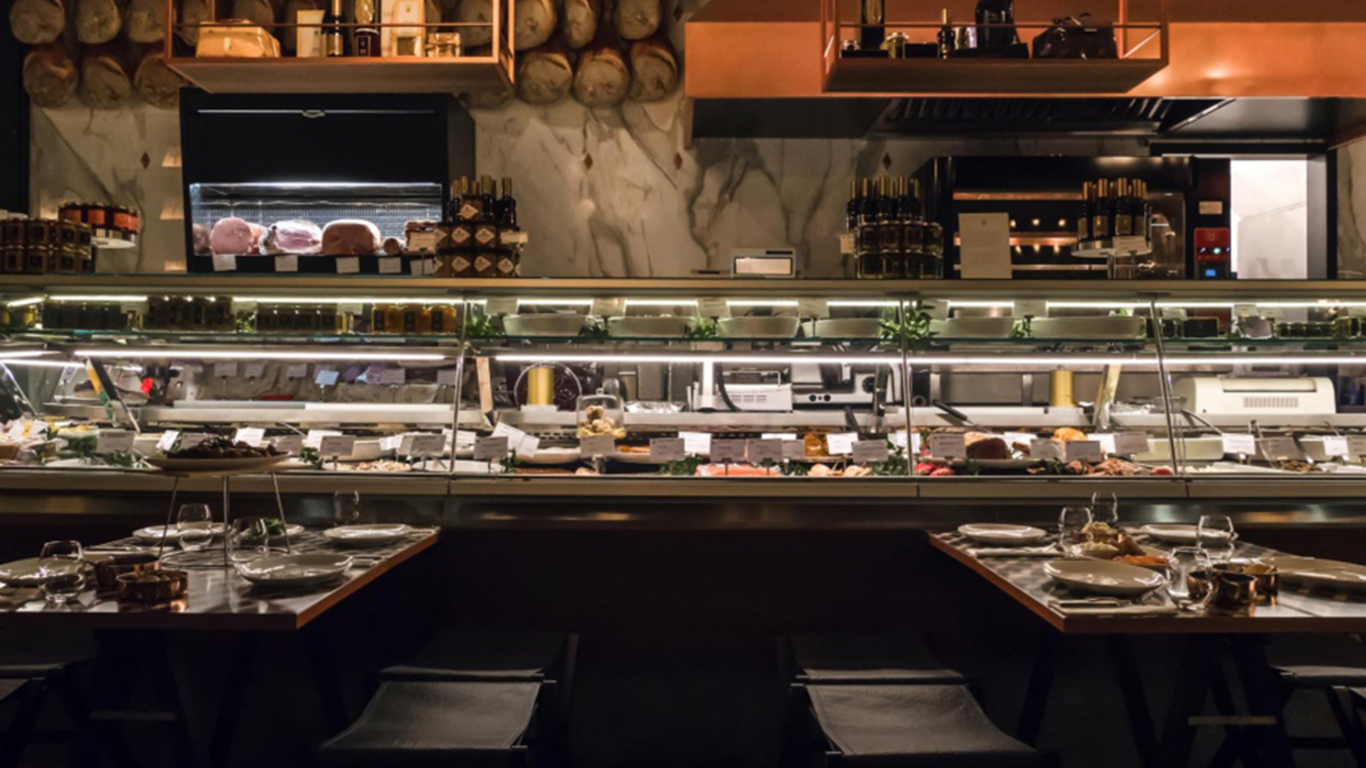
The vast deli counter welcomes visitors at the entrance, showing off the identity which is conveyed through the product, the gesture, the relationship between the staff and the guests. The counter was entirely designed to offer technical performance, aesthetics and practicality, also introducing a new option: that of eating sat directly at the counter.
The folding tables by the counter allow diners to a privileged view of the authenticity and quality of the product and a new and involving experience of gastronomic traditions.
In the centre stands a large rotisserie oven, under a copper hood, which exhibits the preparation of the product with some theatricality.
The space was designed to the millimetre to be able to open and close, multiplying the seats at the tables - 70 covers in total, including 50 at the restaurant/delicatessen and 20 at the wine and cocktail bar. A series of retractable tables allows the restaurant to multiply its covers by creating surfaces where there was once free space.
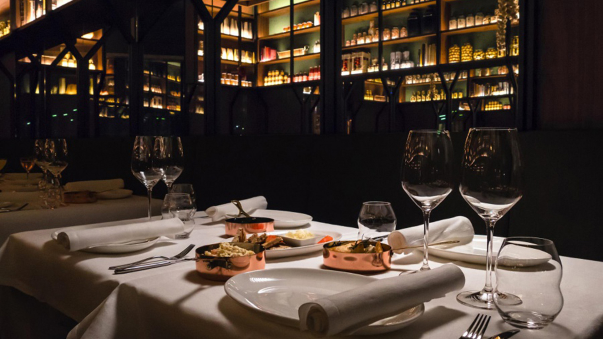
The restaurant is an elongated space in which the mirrors amplify the depth of the display walls: punctuated by vertical pillars and long wooden shelves to display Peck products. To accentuate the feeling of intimacy, the setting is made cosier by a low suspended wooden ceiling in a diamond mesh shape. The theme of the diamond-shaped panels also characterises the decorative motifs of the moving tables, another tribute to the Milanese architectural tradition.
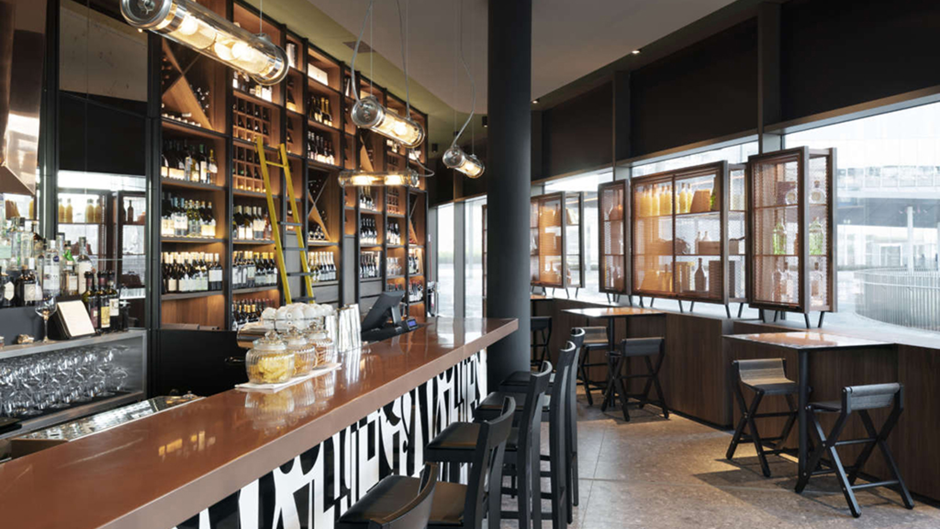
In the wine bar, the shelving units create a metric in which the bottles of wine are treated like notes in a piece of music, expressing the value of the overall composition whilst highlighting a handful of great soloists. The sense of verticality is emphasised by the black lesenes which punctuate both the furnishings and the wainscoting of the bar counter.
The displays set up in the window were designed to avoid complete closure, promoting permeability for the eye as well as the hand.
Two-faced copper windows, built like small architectures, give the space a series of elements for the exterior and the interior, giving depth to both the understanding of the products and their use. Each shelf is also a support for the moving tables which make the space versatile and multifaceted.
The bar of the cocktail station is covered with handpainted porcelain tiles with a unique design created especially for Peck, taken from a historic photograph from the 1950s. The counter is made of copper, along with the large mirror which hangs on the wall behind.
In the evening, the volume lights up like a lantern, revealing the product windows and drawing one’s gaze to the atmospheres of the restaurant which finds intimacy in spotlighting.
The iconic materials of Peck, such as wood, black iron and copper, have been reinterpreted in a contemporary way; even in the kitchen, the white and blue tiles from the kitchens of via Spadari have been reused.
Photo credits: Peck

