JUST PLAY BY NIKE
The new chain of sportswear shops, catering for youngsters aged between four and fourteen, opens its first store at the brand new Adigeo Shopping Centre, in collaboration with Nike Inc.
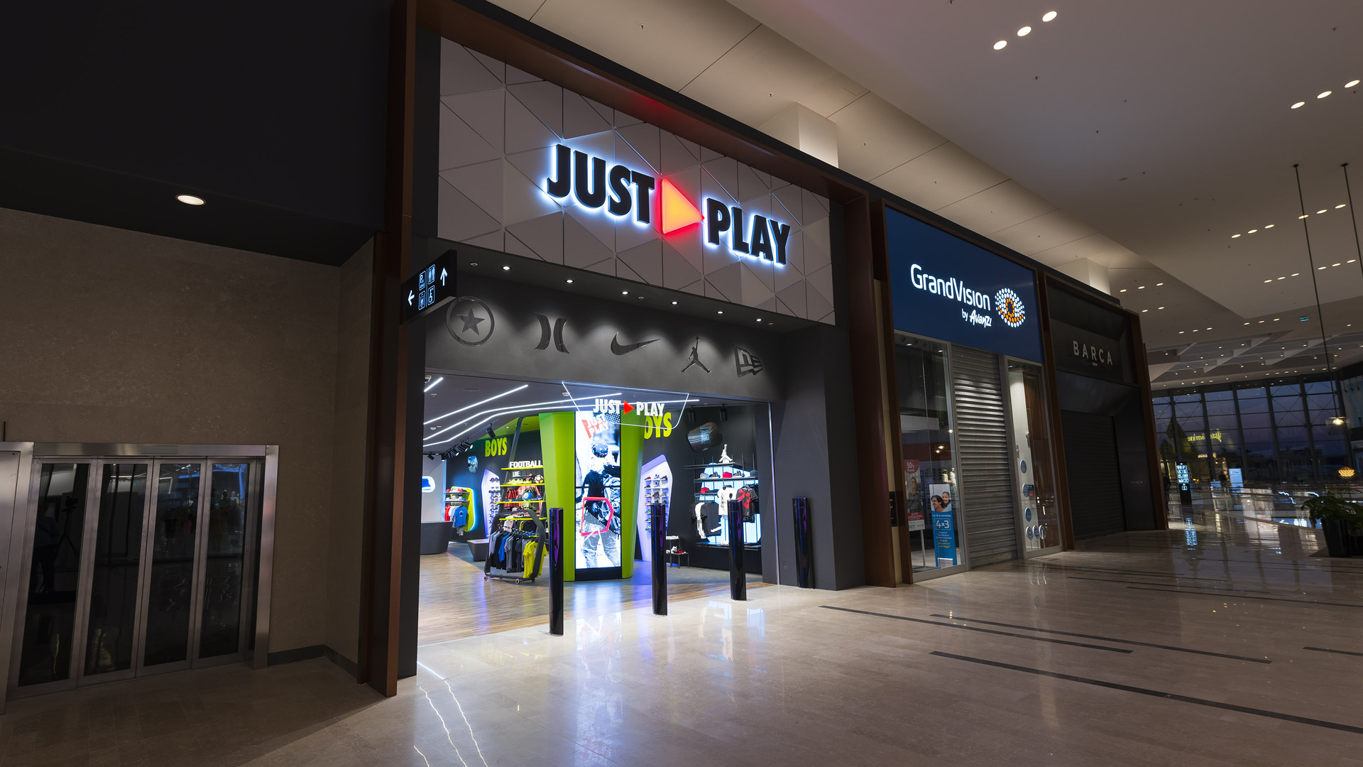
The very first “Just Play” store was inaugurated on 29 March 2017, in conjunction with the public opening of the Adigeo Shopping Centre in Verona, Italy.
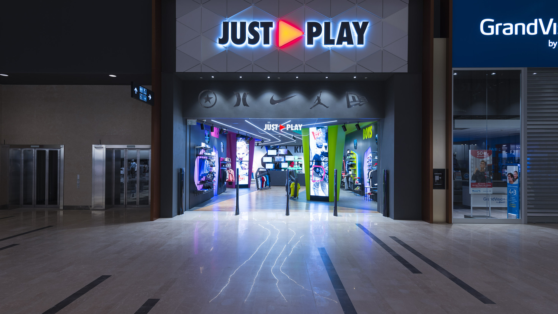
The new sportswear brand, which holds Nike, Converse, Hurley and Jordan brands, plans to meet the growing, specific demands of pre-school kids and young secondary school athletes alike.
The practice worked initially on analysing the strategic, operational and economic feasibility of the project. Based on this survey, it then developed a new concept of store that breaks away from monotonous patterns linked to classical Point of Sale concepts, aiming to become a specific benchmark for young athletes and their parents.
The Concept stems precisely from the observed need for teenagers to find a place they can fully identify with, where they can express their desire to play, to surface and play sports. An analysis made on different sociological and market information has thus come up with a truly innovative store model, the result of a merger between store and online shop.
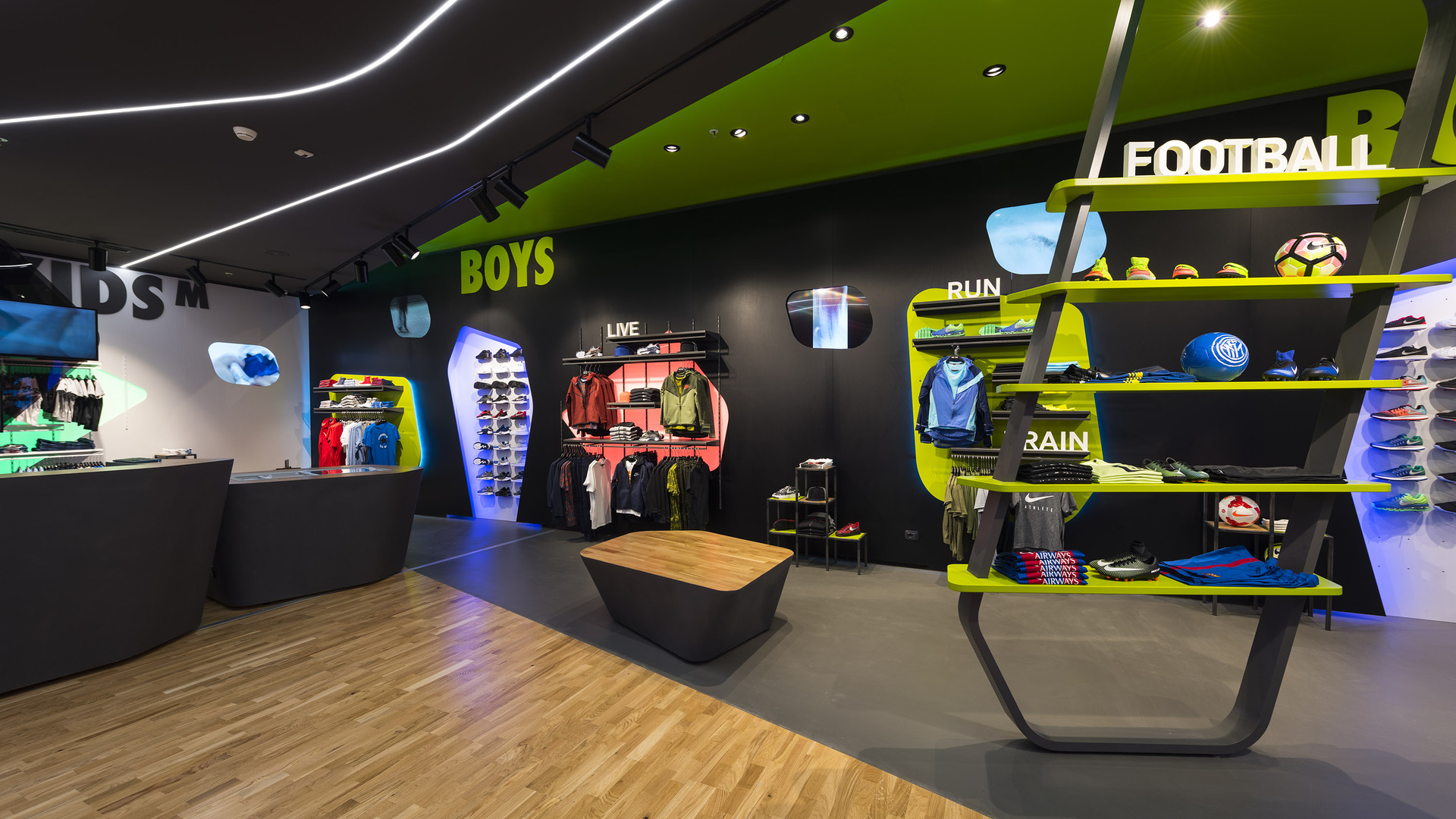
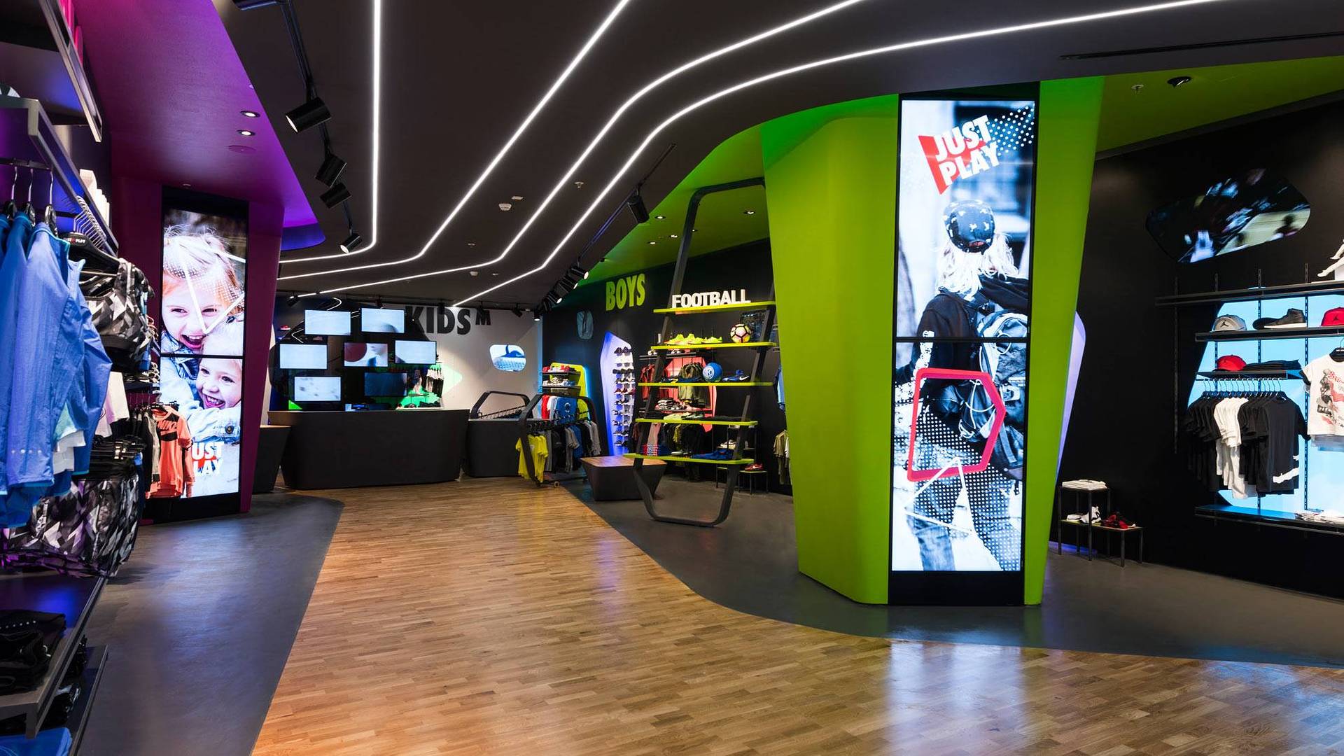
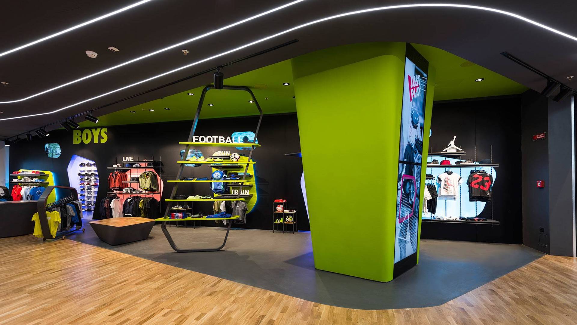
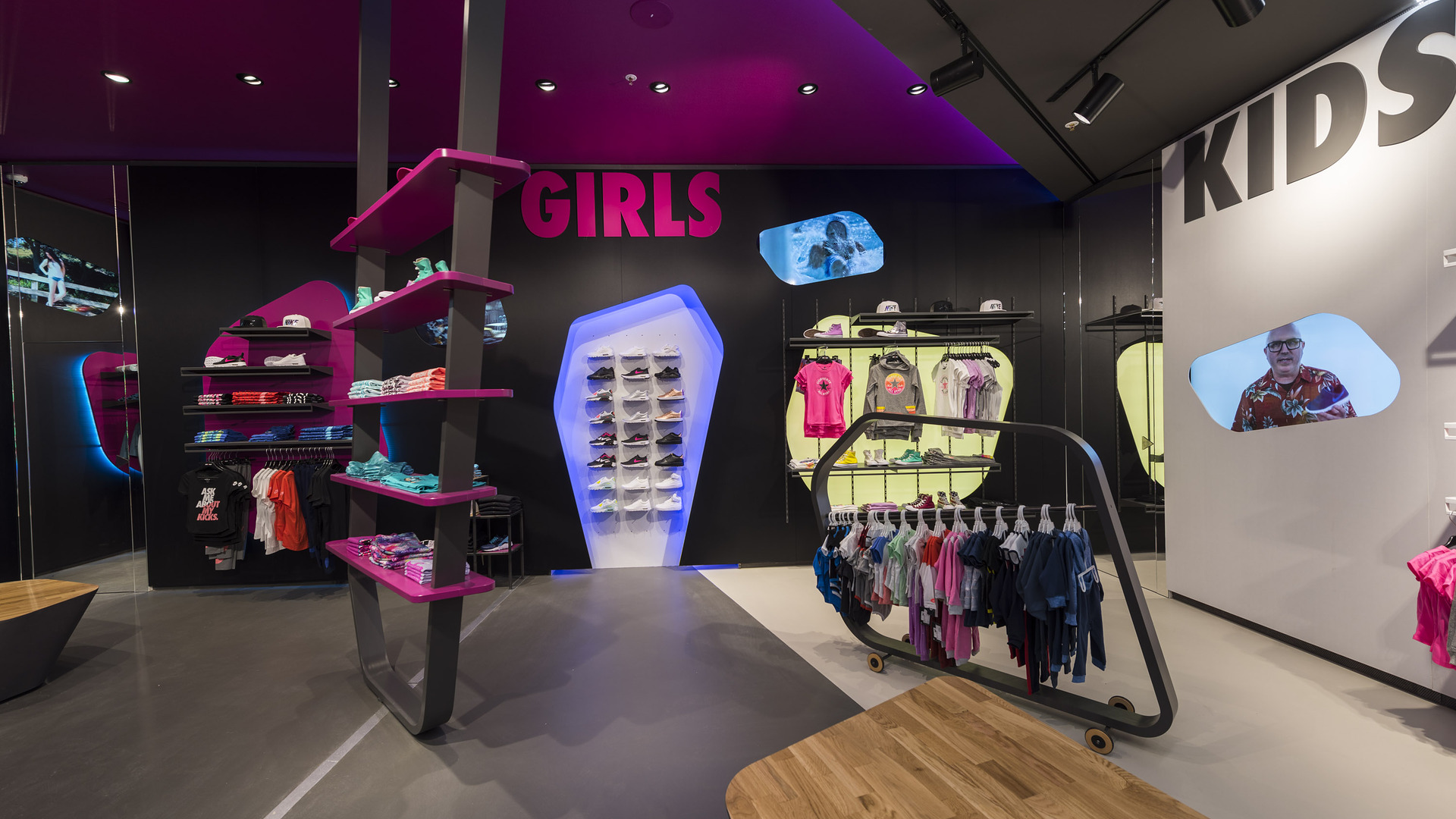
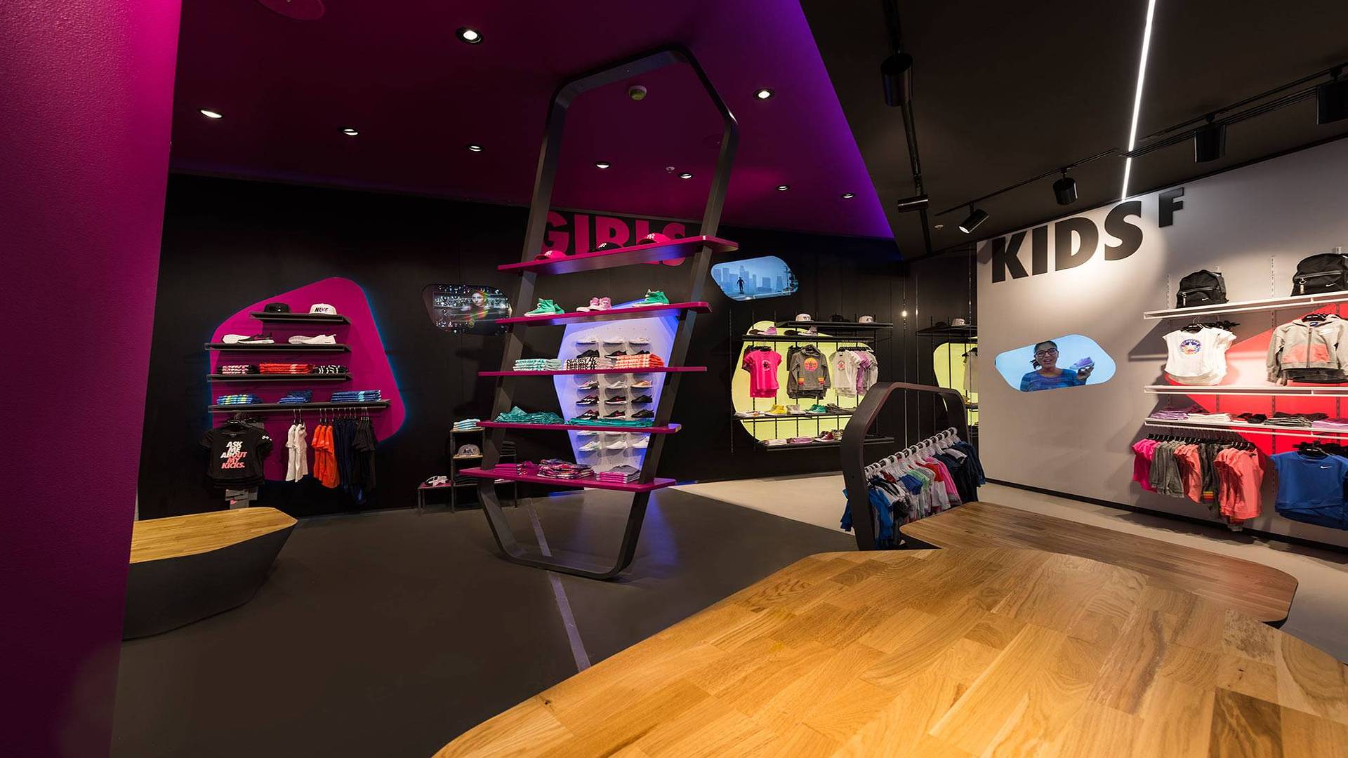
This store impresses with its strong, decisive character and the clear-cut theming of its various areas. The entrance front view opens onto a central path which focuses on a multimedia tree, the hub of the store. On both sides of the path, two mirrored and complementary spaces are immediately recognisable for their colourful aspect, full of vitamins and energy. Two prismatic totems, coloured green and fuchsia, characterise these spaces; at the same time serving as internal communication totems and dressing rooms for the store’s young customers. These also include some impressive, recessed video walls, immediately visible from the entrance and composed of sixteen screens, which can either act independently or form one large image. The totems seem to make a breach in the ceiling, invading it with their dynamic, colourful presence, providing strong impact for a scenic backdrop which is intentionally urban in style.
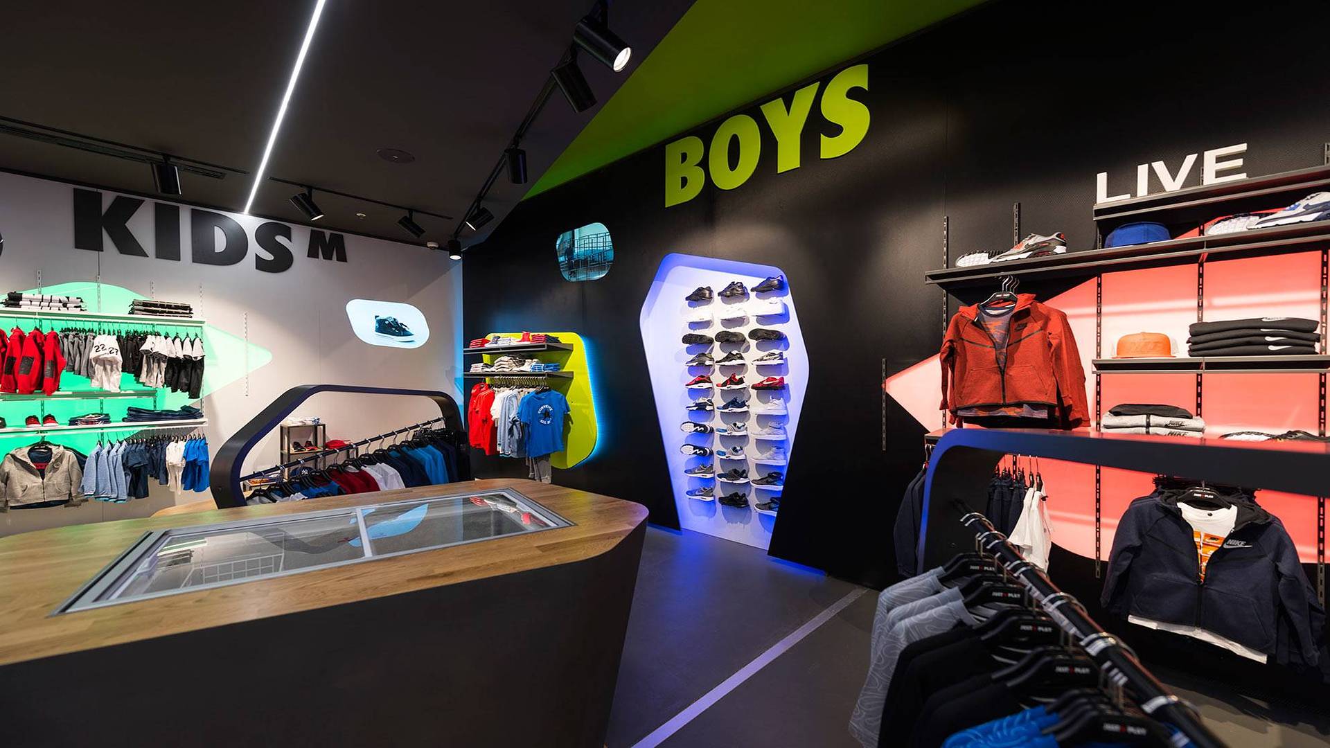
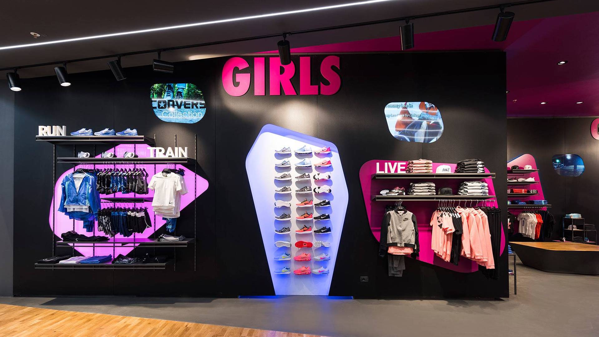
The store is divided into three main areas for the public, according to the two sexes and two age groups, and featuring some micro corners for the four brands. From the architectural and interior design point of view, the Concept exudes dynamism, created using bright colours and irregular shapes, extremely attractive and designed for the specific target.
Important tools for emotional communication include not only, in multimedia terms, the various recessed wall screens along the perimeter, used to define brands and sectors, but also, in concrete terms, the various island units, reminiscent of sports equipment shapes, such as skateboards or surfboards, in contrast with the deliberately essential, almost Spartan, clothes hangers in metal, Plexiglas and lacquered wood.
The floors, irregularly shaped, are partly made of wood, with a clear reference to parquet gyms and typical basketball court markings, and partly in resin, with an effect defined as "street". The ceiling features various bright lines of strong character, reminiscent of an athletics track.
All furnishings are custom-designed and again feature particular irregular shapes and contrast, achieved by the use of wood and metal.
Photo credits: Luca Morandini

